Santa Monica Cursive
It loops, because it’s cursive and that’s what cursive does, but it doesn’t stay between the lines.

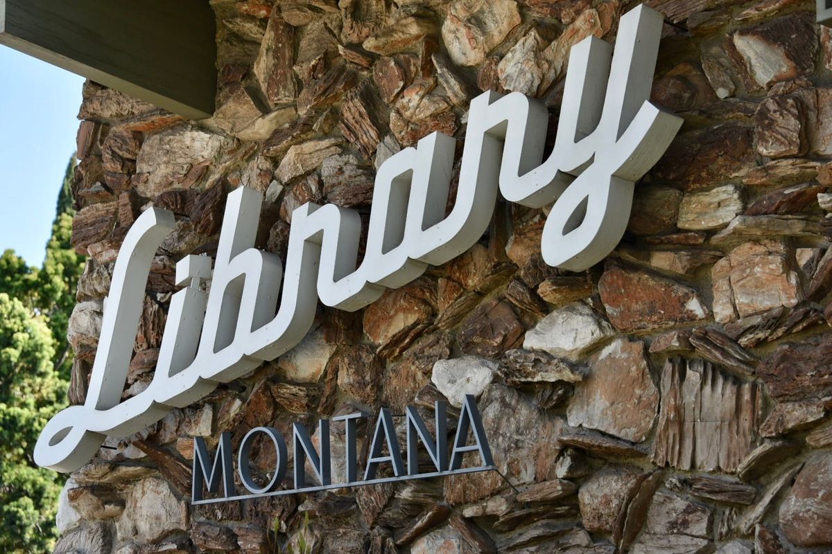
It loops, because it’s cursive and that’s what cursive does, but it doesn’t stay between the lines, instead climbing up, up to the end of the word. It’s Santa Monica cursive, and you can see it on the Montana Branch Library, the Camera Obscura, other places too.
It’s a signature – yes, that’s a pun – of architect Weldon J. Fulton, who designed at least two libraries, one deli and one camera obscura in Santa Monica in the middle of the last century. He was a man of his time, and his style was mid-century modern, and that cursive, that upward trajectory, it pointed to the future, a future of the past, one we can still remember today.
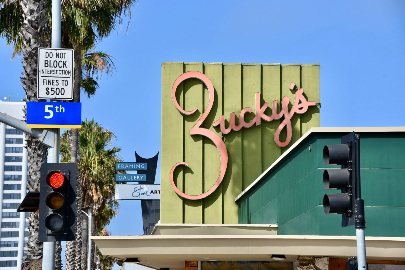
I love it. I’ve spent a long time staring at the writing on the walls of Zucky’s Delicatessen and the Fairview Branch Library, and I can see the fonts aren’t exactly the same. There are differences, but they are both Santa Monica cursive, and they both draw the eye, looping around and up, like a roller coaster that doesn’t need to worry about gravity.
I’ve tried to learn more about the cursive, about Weldon J. Fulton, but I can't find much, except for his obituary, along with a few shoutouts on civic websites.
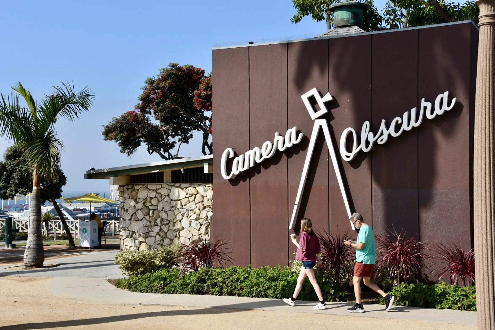
Where did Santa Monica cursive come from? Why did Fulton use it on so many of his buildings? Was he inspired by the Dodgers logo, even though the team hadn't moved to Los Angeles yet? Was it something else?
Did Fulton design those words? Maybe somebody else in his firm drew the letters. Maybe there was a letter guy or gal. The fonts are a little different. Maybe they took turns. We don't know.
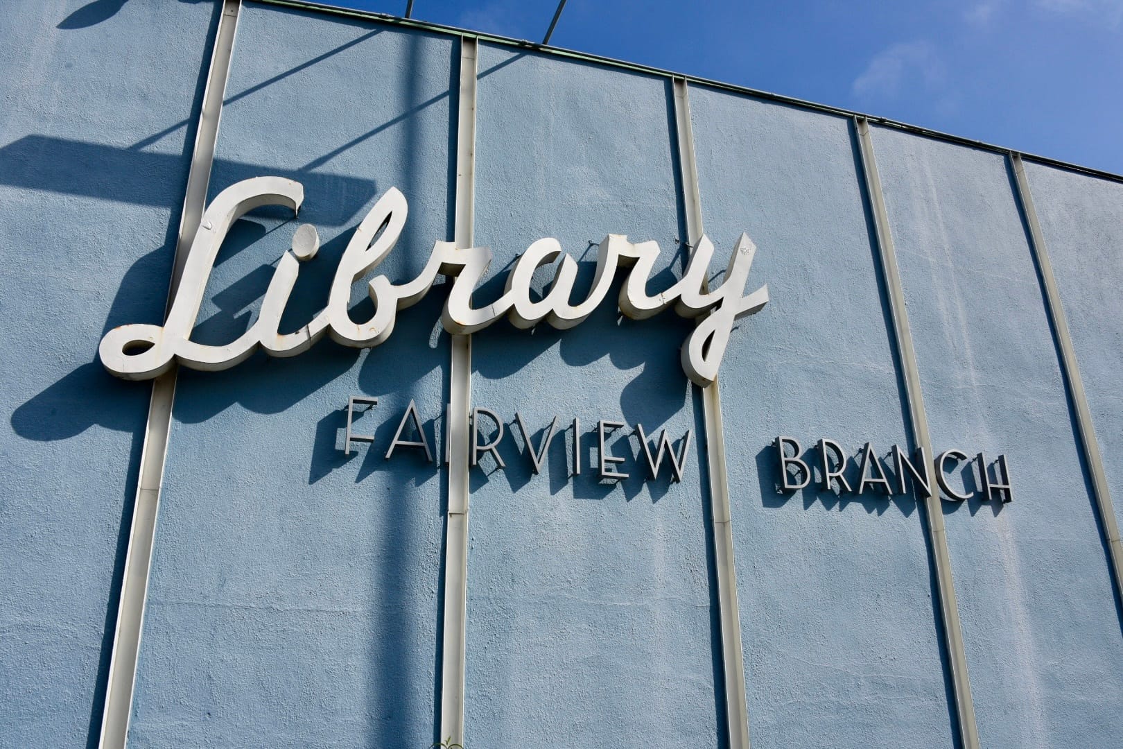
Maybe they were looking forward to the future, as many people were back then, and wondering, and looping, and wanting to go up.
Maybe they wanted us to go up too.